For this project I chose to look at an old infographic I made in high school, as at the time I was interested in barefoot shoes, and their health benefits. As I’ll come to share, I find this style of footwear profoundly interesting, as it is a decisively positive, yet poorly advertised preventative measure for foot, and body injury. I stumbled into the topic while looking for preventative measures for achilles tendonitis, as my family is plagued by these tendons in particular being weak. As a project for a science class, I created the following infographic as an informative poster on the subject.
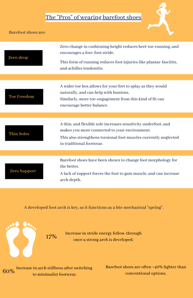
I was pleased with the writing, but I remember wishing I opted for a physical medium for the poster, as I wanted drawn elements to represent what was being described, but at the time I wasn’t proficient with online art programs. I believe this qualitative portrayal in the drawings would help the design transfer ideas to the observer.
Because of this, I chose this poster to upgrade using the new techniques of graphic design covered in week 5 of class.
The main improvements I wanted to make were in the field of:
- A better use of hierarchy to help focus the design
- Diagrams/visuals used on the poster
- More leverage of contrast
- Optimize colour to support my design
- This is using contrast to move the audience around the information on the poster.
- More consideration to proximity and balance
- More online accessibility
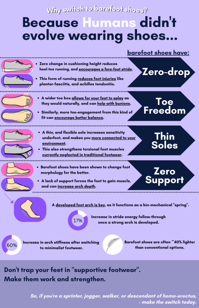
With this poster, I created my own graphics in illustrator to visually portray how the aspects of barefoot shoes brings benefits to the user. This was through a “conventional” vs ”barefoot” visual side-by-side comparison, and by utilizing red and green symbols to portray positive and negative strain/alignment. I also looked to have a concise colour palette, simple yet descriptive imagery, and a consistent style. As well, I incorporated quantitative data through small charts/”percent bubbles”. I think this is a major improvement that’s noted from the old design, and infinitely helps engage, and educate the viewer.
Finally, for added accessibility to the visually impaired, I added a auditory readout of the poster.
Recent Comments