When you used the AI games this week, such as Magic Sketch or AI Duet, how did you find the process of having your work completed by an algorithm? Did it feel true to your intention? Were you happy with the results?
I found that AI games, like Magic Sketch, are extremely interesting in the way that the artificial intelligence interacts with the user, but there is an issue in how this algorithm completes the user’s work. The art piece seems to lose “human touch”. This is because this algorithm, and the numerous others out there, draw from data collected on human preferences, and behaviors.
No matter what, these AI models will always act upon preconceived understandings, and miss the current preferences needed in the moment. For instance, while I was trying to draw a bee in a certain perspective, the Magic Sketch book AI would finish drawing the wings in a fashion other than what I would like. This amounted to the human, myself, having feelings of frustration towards this AI, but we cannot blame this technology, as it doesn’t know better – it doesn’t “think” like us: it has pre-constructed understandings of how to draw, pulled from countless other human interactions during the machine learning training process.
Similar to this I’ve interacted with the AI behind “DALL-E”, which takes a user typed input, and constructs an image based on preconceived understandings on given nouns and adjectives – with this it creates a picture. Usually these pictures are actually quite incredible, but in essence the human had no part of the creative process, other than the brainstorming.
Looking at one of the learning games links provided this week, or another example you’re familiar with, (e.g., Minecraft for Education), describe the elements of the activity that show that it’s part of a game. Which element do you think is the most effective in terms of adding engagement?
I believe one of the key elements of an activity that shows it is part of a game is a sense of freedom: the idea of a player having their own surroundings to explore and to engage with is just asking for interaction and positive engagement: I believe that this ties in with the point of a narrative. It brings interest to the user and allows them to delve further into this media then would be possible in many other forms of media, like pure film for example, as if an individual does not find interest in the happenings show, there’s no direction that they can take the reigns for. By bringing the power of story, and exploration to the hands on a viewer, their own engagement brings them further into the narrative, or world building of game. I believe that this speaks to the example mentioned of “Minecraft Education Edition”: as this open world concept of Minecraft allows players to explore, discover, and create within the boundaries of this make-believe world. many find this as a perfect time to embrace creativity, and to collaborate with other learners. I believe these interests thrive in this environment due to the shot-calling power of the players behind the controller guiding their own experience in a story.
As seen in this video, By engaging students in a medium they already know, and enjoy Educators were actually able to engage students outside of the designated school hours for the project, as students were logging on during their own time from home. The sense of autonomy that comes with interacting with a medium one already understands well allows for the sense of freedom: engaging with familiarity in this kind of a creative way can bring attention – instead of boredom.
Which of the trends identified is in keeping with your own experience of multimedia learning and which are not? Is there a trend that is missing from this list in your experience? Which of these trends do you think will have the biggest impact on learning in the next two years? Which do you think will still be around in ten years?
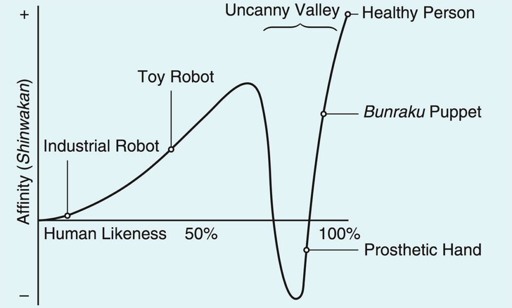
I believe that augment is reality and virtual reality AR attractive for some forms of multimedia learning, however I feel that currently there is sort of technological fad that, in practice may not actually withhold the test of time. let me Begin by stating that I think that these Technologies are incredible for portraying geological views, some forms of long distance social interaction, end visualizing prototypes in an engineering sense, along with a few other applications. However, I feel that the technology is currently being overblown due to private company involvement, and the overall pipe that comes from the masses due to this seemingly futuristic technology. virtual reality technologies seem like the flying car of the 21st century – attractive in thought but upon closer inspection, may not be all that practical. involvement from meta, formerly Facebook, seems 12 greatly expedited the arrival of accessible virtual reality headgear to the consumer Market. They promised this technology to be a sort of replacement for normal social interactions. I’m not completely sold on this, and this is coming from someone who has spent extensive time in virtual reality. the technology does not seem to mesh well with our overarching Biological systems, for instance many people can experience a “uncanny valley” when dealing with avatars that are said to be a adequate replacement for true social interaction. The human brain is adept at noticing minor changes that don’t quite sit well next to an understood visual, and even if something’s close to perfect, small differences can cause an emotional reaction.
Similarly the aspect of motion sickness is prominent in virtual reality, known as “VR Sickness”, and especially the same thing as motion sickness, or seasickness, is when our inner ear end our visual biological systems receive different understandings about her environment. Because of this our biology tells us to become nauseous, as in the past this was a way to protect against the ingestion of toxins, and the symptoms that go along with nausea are the body’s best way to deal with this. I think this highlights why virtual reality, and to a lesser degree augmented reality battle with our biological systems, this technology does not sit well with our inherent structures.
What storytelling techniques have you used instinctively and which ones require more work for you?
Some storytelling techniques that I’ve used instinctively have been to use a conversational tone, to add visual elements, to keep texting images together, and to focus on learning outcomes. These came instinctively to me due to my use of them in school projects predominately, as well as some of my own creative work. I find I’m good at striking conversations, and delving into the main learning outcomes – all while including on-screen elements that help direct attention to myself, and the subject being learned.
However, some of my shortcomings have to do with just that, not being short: it’s quite easy to balloon the length of a video, or other presentation, however the best of the best will always find a length that keeps things engaging, well providing the largest amount of learning outcomes. Often enough this means short-form media, which is now commonly seen in social media apps like Tik-Tok, and Instagram reels. This form of media is highly digestible, and allows users flexibility in their learning, as they can choose a topic or subtopic to delve into. These apps also organize this media in a form that keeps it accessible.
Which design principles would you use to create a infographic? Which elements of a ‘good infographic’ would you incorporate? What other principles did you consider?
Main principles to keep in mind when creating an infographic in my opinion are that of contrast, alignment, repetition, and proximity. As I’ve mentioned before, I’m taking a marketing design course this semester, and the acronym we’re taught to represent these variables of the most importance is C.R.A.P.
Although other principles are important, a design that incorporates these 4 principles will cover more of the important basics then any of the others listed.
However, with this being said some that I think are a major “cherry on top” are the principles of: hierarchy, and balance. By utilizing hierarchy, designs are able to prioritize the main idea, or take away from an infographic. Whereas balance I see more as a aesthetic need, and I would also argue that balance includes the other principle listed of “white space”, as balance includes the aesthetic “weight” of a piece – meaning the distribution of items on a slate.
Provide an example of a multimedia learning principle you have intuitively followed in the past, and an example of a multimedia learning principle you have broken in the past.
One Multimedia learning principal that I have intuitively followed in the past is the principle of chunking – or segmenting. I naturally break big ideas or more complex systems into more manageable pieces for more easy learning. This intuitively makes sense, as the human brain naturally looks for patterns. By doing this, predictions, and quick understandings, are more readily available. With proper chunking, big ideas can come across as simple, as long as good organization is present. I also enjoyed that the article included the aspect of colour coding – as this is a great way to incorporate chunking into studying. Something even as simple as highlighting a textbook in a way can help you more easily break down big ideas into smaller segments.
Although I’ve not incorporated it knowingly into work before, I found the principle of modality interesting. It makes sense that different groups will have different cognitive loads when interacting with a given topic. For this reason, different levels of vocabulary, and interaction are needed in order to not overdo a learner’s own intrinsic load.
Of all the principles of Cognitive Theory of Multimedia Learning we looked at this week, which seem intuitive to you?
I believe that most of these principals were overall intuitive, however one that meshed well with other courses that I’m taking is the principle of contiguity.
This is because I’m taking marketing design courses, where we learn the acronym C.R.A.P, meaning: contrast, repetition, alignment, and proximity. I believe that these last two capture exactly what the principle of continuity explains – the coordinating of depictions, by using alignment and proximity to the benefit of the learner.
By allowing the eye to easily chunk pieces of information together, we can more easily learn that these items are correlated. As an example from the video, this could be a label, and a diagram. It’s much more useful to put a label directly into the proximity of where it is needed in the diagram, instead of utilizing a legend, as it moves relevant information away from where it is needed.
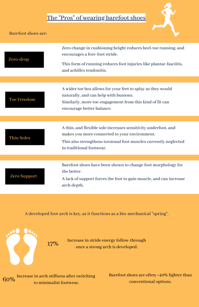
For this project I chose to look at an old infographic I made in high school, as at the time I was interested in barefoot shoes, and their health benefits. As I’ll come to share, I find this style of footwear profoundly interesting, as it is a decisively positive, yet poorly advertised preventative measure for foot, and body injury. I stumbled into the topic while looking for preventative measures for achilles tendonitis, as my family is plagued by these tendons in particular being weak. As a project for a science class, I created the following infographic as an informative poster on the subject.
I was pleased with the writing, but I remember wishing I opted for a physical medium for the poster, as I wanted drawn elements to represent what was being described, but at the time I wasn’t proficient with online art programs. I believe this qualitative portrayal in the drawings would help the design transfer ideas to the observer.
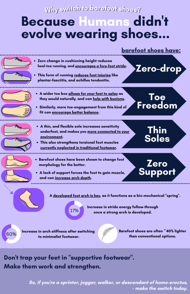
Because of this, I chose this poster to upgrade using the new techniques of graphic design covered in week 5 of class.
The main improvements I wanted to make were in the field of:
A better use of hierarchy to help focus the design
Diagrams/visuals used on the poster
More leverage of contrast
Optimize colour to support my design
This is using contrast to move the audience around the information on the poster.
More consideration to proximity and balance
More online accessibility
An auditory readout for the above new poster.
With this poster, I created my own graphics in illustrator to visually portray how the aspects of barefoot shoes brings benefits to the user. This was through a “conventional” vs ”barefoot” visual side-by-side comparison, and by utilizing red and green symbols to portray positive and negative strain/alignment. I also looked to have a concise colour palette, simple yet descriptive imagery, and a consistent style. As well, I incorporated quantitative data through small charts/”percent bubbles”. I think this is a major improvement that’s noted from the old design, and infinitely helps engage, and educate the viewer.
Finally, for added accessibility to the visually impaired, I added a auditory readout of the poster.
I have used text to speech tools before – majorly in language translation applications. This is because I was, (and still am!), a beginner in learning Mandarin, which is a very “tonal” language. I found that learning through hearing is very helpful to my learning: this catalyzed in the form of Duolingo – a popular language learning application on iOS and Android. I found “Duo” very helpful, as the app links text to the language spoken out loud, and because of this way of teaching I found I made great strides in learning.
(Blanco, 2020)
Unfortunately, Duolingo only supported default voices in this text to speech – from my recollection, this was 2 male voices and 1 female voice. In my opinion, I found one of the male voices the easiest to understand, as it often had a slower cadence which increased my tracking of vocabulary used.
Of course, with this language program the UDL guidelines wouldn’t be the best applied, as for example: “[using] visual analogues to represent emphasis and prosody (e.g., emoticons, symbols, or images)” (CAST, 2018) may not be the best applied, as it would take away some of the challenge that comes from learning a new language in an auditory way. Creators of the app would need to be careful to balance the vagueness of emoticons for example, to not give too much away about the question visually to the listener.
What made you decide to take this course? What are your learning goals this term?
I wanted to take this course because I’m currently studying healthcare technologies, but I have an interest in marketing, event planning, and graphic design – I believe that this course will help me pursue different forms of media that can be used for these purposes.
Provide an example (uploaded, linked or embedded in your WordPress blog posting) of:
Interactive media:
An example of interactive media could be a new style of TV called “Interactive TV/Films”. Examples of this that can be found on Netflix are “Black Mirror: Bandersnatch”, and “You vs. Wild”. These films act similar to the old style of “choose your own adventure” books, where the viewer can interact with the choices made in the story, and can affect the outcome of the story. These are similar to video games, but have less moments of these interactive moments compared to video games, and usually just have a multiple choice screen.
Multimedia:
Multimedia is taking more than one form of media and combining them. An example of multimedia could be as simple as a TV show, as the user can get visuals, audio, and possibly even text with the use of closed captioning!
An example of closed captions (CC).
Interactive Multimedia:
Takes more than one form of media and combining them, while changing outputs to fit inputs from a user. This is the crossover of the aforementioned Interactive Media, and Multimedia, with an example of interactive multimedia being Meta’s Quest 2 system – this VR system allows a user to receive VR visuals, and audio, while interacting with the media similar to a video game, or media browser, among other uses.
Recent Comments